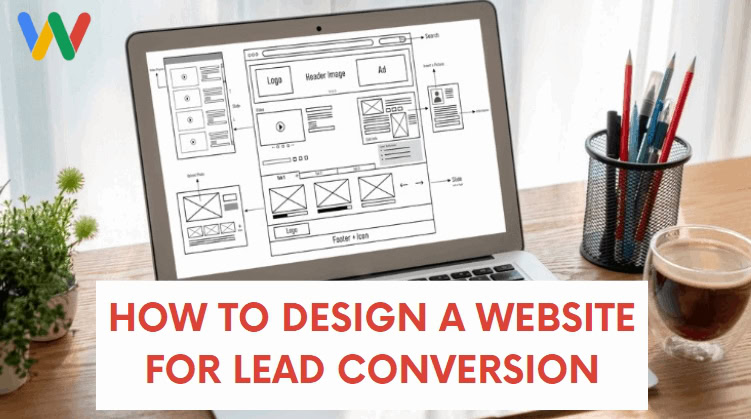
Your website is often the first point of contact with your target customer, which makes it an important part of your marketing funnel.
Plus, it’s where most conversions take place! Even people who get your business card or learn about you from a connected TV campaign, eventually check out your website somewhere during their buying journey.
However, simply having a website isn’t enough to convert visitors into leads or customers.
Table of Contents
In this post, we’ll tell you how to design a website that’s fine-tuned like a Formula 1 race car 🏎️ for lead conversions. By the end of it, you’ll have all the techniques you need to make your website a lead-generation machine.
Let’s Dive In!
How to Design a Website for Lead Conversion
Converting website visitors into leads is one of the toughest things to do as a business owner. It can be very frustrating to see traffic coming to your site, but not seeing any conversions.
The design, navigation, and copy of your website influence its ability to convert leads for you through phone calls or form fills.
Thankfully, making a few small adjustments in your design and copy can improve your results significantly!
Here’s how you can boost your results with design best practices.
Create a Clear and Concise Design
A complex website isn’t good for user experience, which means it’s not good for lead conversion.
You want your website to be simple and easy to navigate. This means having clear and concise design elements that guide your visitors towards taking action.
The goal should be to help visitors get the desired information as easily as possible.
Here are a few best practices to implement:
- Choose high-contrast and easy-to-read fonts
- Highlight important information with prominent colors
- Use white space to maintain distance between elements
- Include a call-to-action on every page
- Make Your Website Mobile Friendly
- Ensure Fast Loading Speeds
Keeping everything clear and concise helps visitors quickly understand what you have to offer. Have you ever visited a website’s homepage and spent 5 minutes reading before you actually understood what that business actually offered? Chances are, you would have navigated away without taking further action. That’s why it’s important to have a clear and concise design that guides your visitors towards taking action.

I’ve taken on SEO clients with websites like this before and one of the very first things we had to do was send them to our resident branding expert to do a complete makeover on their core messaging.
If your website’s content is convoluted, visitors will quickly lose interest and move on to a competitor. So make sure to review and refine your content regularly to ensure it accurately reflects who you are and what you do in a way your ideal customer would easily understand it…not the way you think about things as an industry insider.
Understand That Your Customers Use Different Terminology Online
If your website content is full of jargon and industry terms instead of the words and phrases an average person might use, it can be confusing and frustrating for visitors. Remember to use language that is simple and easily understandable, yet still conveys the message you want to get across.
Write Strong and Compelling Calls to Action
Strong CTAs help you convert visitors into leads or customers, which is why it’s one of the most crucial aspects of web design.
A CTA is important because it lets your audience know what they should do after consuming the content on your page.
A call to action typically appears at the end of a web page, prompting the audience to take action. They can also appear in a sidebar, pop-up, or within the content itself.
The action can be anything depending on your goal, including:
- Subscribing to a newsletter
- Purchasing a product
- Downloading a file
- Filling out a contact form
- And more
Not all CTAs are created equal, of course. The most compelling ones are clear, concise, and use action-oriented language.
CTAs Will Make or Break a Page
Even if your content checks all the boxes, if your CTA isn’t good enough, you may not generate any conversions.
The key to creating click-worthy CTAs is to use powerful copy. A call to action should also be simple, concise, and highly visible.
Since it’s the most important part of your page, it should stand out from other text on your page.
If you’re using a button, use bright and contrasting colors to make it easy to spot. It’s also important to create urgency with your CTAs. Using words like “limited time offer” or “act now” can motivate your audience to take action immediately.
The placement of a CTA also impacts its effectiveness. The best places to use CTAs include:
- At the top of your homepage
- At the bottom of every blog post
- Product or service pages
- On the sidebar
Pro Tip: Adding the CTA to an exit-intent pop-up window is also a great way to boost conversions on an eCommerce page!
Make Your Design Responsive
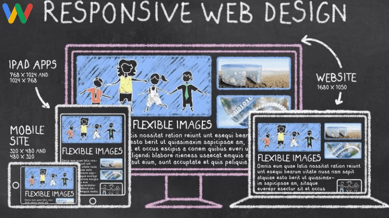
People access web pages through desktops, mobile phones, and tablets. Long gone are the days where you could assume that just because your target audience is in the B2B space, you might get away with a site that looks like garbage on mobile phones. That’s why you need a responsive website, no matter who your audience might be.
A responsive website adjusts its design based on the device someone views it on, offering a satisfactory user experience. Responsive websites are simple to build on platforms like WordPress, Shopify, and Squarespace.

Keeping your website responsive is a crucial Google SEO factor as well.
This means if your website isn’t responsive, it may not get traffic from Google search.
The bottom line is when your website is responsive, you can drive more traffic to it and convert more leads.
If it’s not looking so great on a smartphone, you’re missing out on potential customers.
So why take the risk? Invest in a responsive website to ensure your business attracts and retains customers from all devices.
It’s not just about aesthetics, it’s about providing a seamless user experience that can ultimately lead to more sales and revenue for your business.
Implement SEO Best Practices
Search engine optimization refers to making your web pages more rank-worthy on search engines.
This means an SEO-friendly website can attract high-quality leads from search engines like Google.
However, implementing SEO best practices also improves your site’s user experience.
And, better user experience almost always leads to a rise in conversions.
A well-rounded SEO strategy involves:
- Keyword research
- High-quality content creation
- Page speed optimization
- Making your site technically sound
- Ensuring mobile-friendliness
- Implementing internal and external linking
- Attracting links from relevant online sources (Link-building)
Related Post: Important Types of SEO Services
Use High-Quality Visuals
Images and videos on your site play a major role in converting visitors.
They’re more effective at grabbing attention and driving engagement than plain text. Not only that, but if your content is a boring wall of text with nothing to break it up you run the risk of losing the reader’s interest. So leverage rich media to your advantage.
But, only use high-quality images that align with your brand and are relevant to the topic.
In addition, the layout and presentation of images and videos matter too.
Make sure they complement the content around them and offer a smooth user experience.
Use Trust Signals

Trust is a powerful driving force when it comes to conversions.
This is why using trust signals on a landing page or website can skyrocket your results. Trust signals might be things like industry awards or security badges you display prominently on your main pages.
Social Proof
Customer reviews and testimonials prove that you’re a legitimate business.
You can easily improve conversions by adding a dedicated testimonials section on your website. This is especially important for local businesses, as positive reviews from nearby customers can greatly influence potential customers.
Additionally, including social media feeds or “Like” and “Share” buttons on your website can also serve as social proof.
Security
Online security means a lot, especially if financial transactions are involved.
Thankfully, you can make your site secure by installing an SSL certificate.
An SSL, when installed, secures information transfers on your site. Here’s what it looks like to a visitor:
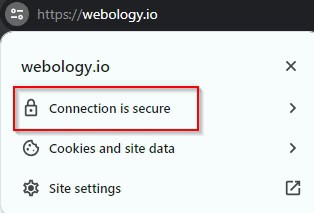
Terminology by Webology: SSL Stands for Secure Socket Layer. It is a standard security technology that encrypts data between a web server and a browser. This ensures that any sensitive information, such as credit card numbers or personal details, cannot be intercepted by hackers.

Integrate Social Media
When people see that others are actively engaging with and sharing your content, it helps to build trust in your brand. Try to post to your main platforms at least twice a month. Add your social media links at the bottom of your website too. This can help build trust and improve your visibility.
Optimize Site Structure for Conversions
An optimized site structure helps visitors find the information they need easily.
Design your website with CRO best practices in mind.

For instance, the primary navigation should only have links to the most important web pages on your site. Less important pages can be added to your footer area or linked to from individual pages or posts.
Plus, every element of a landing page should be focused on a single call to action. This could be signing up for a newsletter, filling out a contact form, or making a purchase. Too many options can lead to confusion and decrease conversions.
You May Also Like: The Importance of Accessibility in Web Design
Use Simple Lead Capture Forms
If you’re using pop-up forms to collect leads, don’t ask for more information than you need.
For instance, don’t ask for their last name if it’s not necessary. People are very privacy-conscious these days and prefer to give out less personal information when possible.
The goal is to make it easy for visitors to fill out the form and to set their minds at ease that you’ll be responsible with their data.
How to Design a Website for Lead Conversion: Conclusion
Your website is often the most important touchpoint with your target customer. It’s where most of the conversions happen.
However, to convert visitors into leads or sales, you need your website to check all the CRO (Conversion rate optimization) boxes like the ones you can find in our design gallery by clicking on the image below:
Here’s a quick recap of How to Design a Website for Lead Conversion:
- Keep it simple and concise
- Make it responsive
- Use compelling CTAs
- Implement SEO best practices
- Leverage visuals
- Use trust signals
- Optimize site structure for conversions
- Keep your forms simple
Doing all that while you run a business can be overwhelming! 😅
Focus on what matters more and let our design experts take care of this aspect of marketing. Webology offers a range of services to help you design a website that converts your target customers into leads or sales.
Our team of experts will work closely with you to understand your business goals and target audience. We’ll then create a custom website design that reflects your brand identity and speaks directly to your potential customers. Our designs are not only visually appealing but also optimized for conversions, ensuring that every visitor has a clear path to becoming a lead or making a purchase.
Get in Touch

