When it comes to design, color isn’t just decoration—it’s the unspoken language of emotion. It’s that subtle nudge that tells your audience, “Feel this.” Whether you’re crafting a logo or designing an entire website, understanding the magic of color theory can turn an average concept into a jaw-dropping masterpiece.
Key Takeaways:
- Color impacts emotion and creates connections.
- Using the right colors can tell a story without words.
- Effective color choices are always intentional.
- Balance, contrast, and harmony are key to color success.

Table of Contents
Designing with Intention
Great design isn’t about slapping two colors together. It’s about making deliberate choices. The right palette creates balance and harmony, while the wrong one results in visual chaos. A rich navy paired with crisp white and gold accents exudes sophistication, while neon green with bright pink can feel overwhelming.
Here are three quick tips for crafting intentional color combinations:
- Start with a purpose. What emotion do you want your audience to feel?
- Use contrast thoughtfully. It creates clarity and guides visual hierarchy.
- Stick to a limited palette. Too many colors can dilute your message.
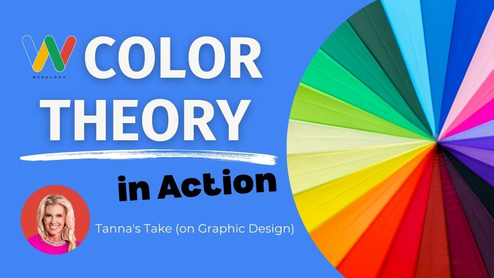
The Color Wheel:
![]()
The color wheel is an essential tool for any designer looking to master the art of color balance and harmony. Understanding how this wheel operates enables designers to create dynamic and appealing visuals that captivate their audience. Basic color theories tell us that colors opposite each other on the wheel are complementary, meaning they create a harmonious balance when paired together.
This table illustrates how strategic color selection influences the emotional impact of visual compositions, guiding designers in creating effective and appealing designs.
| Color Scheme | Description | Emotional Impact |
|---|---|---|
| Analogous | Uses colors that are next to each other on the color wheel. | Creates a harmonious and serene atmosphere, often associated with tranquility and comfort. |
| Analogous | Example: Using shades of blue, teal, and green in a design. | Evokes a sense of calm and stability, often found in nature-inspired designs. |
| Triadic | Utilizes three colors that are evenly spaced around the color wheel. | Offers a vibrant and balanced look, promoting energy and vitality. |
| Triadic | Example: Combining red, yellow, and blue in children’s educational materials. | Enhances excitement and engagement, often appealing to a youthful audience. |
Creating Visual Impact with Contrast
Contrast is not merely about color difference but also about balancing tone and hue to establish a structured visual narrative. Effectively using both cool colors and warm hues enhances depth and texture, offering an example of how strategic contrast lays the foundation for visually appealing and emotionally resonant designs.
Balancing Light and Dark Elements
The balance between light and dark can spark strong emotions. Lighter elements bring clarity and a sense of openness, while darker ones add depth and stability. This contrast plays a key role in grabbing attention and directing the viewer’s focus across a composition. Color harmony is crucial in creating a visually balanced design.
Choosing Secondary Colors
Crafting a complimentary scheme takes skill and practice. Secondary colors, such as green, orange, and purple, can add depth and create a sense of harmony when paired with primary colors. It’s important to carefully consider the placement and intensity of these secondary hues in order to achieve the desired effect.
Why Emotional Impressions Matter
True story—once, I created a logo in the softest blue, aiming to convey calmness and reliability. The client’s response? “It feels like a hug.” That’s the holy grail of design—making someone feel.
People may not remember the exact fonts or layouts you used, but they’ll always recall the emotional connection your colors created. That’s your mic drop moment.

Crafting Emotionally Engaging Experiences
Cool tones can bring a sense of calm, while warm colors spark energy and excitement. Every color choice influences how your audience feels and perceives your message. With just a pinch of strategy, you can tell your story in a way that sticks with your audience and leaves a lasting impression.
![]()
Colors such as blues and greens are often referred to as cool colors, helping establish a calm and reliable atmosphere. This emotional resonance is crucial for building trust and establishing a serene brand identity. Conversely, colors like reds and oranges can create excitement and urgency, perfect for dynamic and energetic messaging.
Using these cool colors in thoughtful combinations allows you to cater to different emotional spectrums and create compelling storytelling woven into your design.
The Business Case to Take Action on Color Theory
![]()
Emotions driven by color can drastically alter purchase decisions, brand loyalty, and user engagement. For instance, a soft pink might suggest tenderness and care, perfect for a wellness brand, whereas a lush green might symbolize growth and vitality, resonating with an eco-conscious audience.
The right color palette tells your audience that you’ve considered their feelings and experiences. This thoughtful narrative approach will not only engage but also nurture loyalty, reinforcing your brand’s story every time they encounter your color scheme.
Your Next Steps
The world doesn’t need more uninspired designs. Use color intentionally, evoke emotion, and create experiences that resonate deeply with audiences.
Go ahead—paint your designs boldly, beautifully, and with intention. Because trust me, the world could use your magic.
Tanna McGuire is an artist, designer, and the Creative Director at Webology. With a passion for color and storytelling, she uses her skills to create impactful designs that leave a lasting impression on clients and audiences alike.
Frequently Asked Questions on Color Theory and Design:

What is the role of color theory in design?
Color theory is a crucial methodology that helps designers understand how colors interact with each other. It enables designers to intentionally choose and use colors to create contrast, harmony, and send specific messages.
![]()
How do contrasting and harmonious color palettes affect design?
Contrasting color palettes use colors that are opposite each other on the color wheel to create dynamic and attention-grabbing visuals. These palettes emphasize differences and can energize a design. On the other hand, harmonious color palettes, often using analogous colors, create a soothing and balanced appearance, ideal for fostering peace and unity within a visual composition.
![]()
What is the significance of the color wheel in design?
The color wheel is a vital tool for designers to understand and apply color balance and harmony in their work. It helps in visualizing the relationships between primary, secondary, and tertiary colors.
![]()
How can color influence brand perception?
Color plays a pivotal role in brand perception by evoking certain emotions and associations. For instance, blue might convey trust and stability, while red can suggest excitement and urgency. The strategic use of color in branding can strengthen the visual story and emotional connection with the audience, enhancing brand loyalty and recognition.
![]()
What are some practical applications of color theory in digital design?
Color theory is applied in digital design to create visual hierarchy, enhance readability, and convey specific emotions or messages. It’s a mix of science and art that helps designers create aesthetically pleasing and effective designs.

Webology’s Approach to Mastering Color in the Digital Age
At Webology, we recognize color as a powerful vehicle for transformation in digital marketing. Our approach is to integrate color theory into client strategies, ensuring their digital presence not only stands out but also resonates deeply with their audience. We begin by understanding the brand’s core values and target audience, crafting a tailored color palette that’s both memorable and effective.
Our team is dedicated to staying at the forefront of digital trends, constantly refining our techniques to adapt to an ever-changing landscape. With the advent of new color technologies, such as dynamic color adaptation for device responsiveness, Webology is poised to push the boundaries further.
Based on Webology’s innovative techniques, here are key strategies to master color in digital marketing, ensuring your brand captivates and communicates effectively:
![]()
- Understand cultural connotations of colors to align with global audiences and reinforce brand messaging.
- Utilize contrast to direct user attention and highlight key information.
- Implement color psychology to evoke desired emotional responses from your audience.
- Conduct A/B testing with different color schemes to determine the most effective palette for conversions.
- Leverage AI tools to analyze and predict upcoming color trends in your industry.
- Ensure color accessibility to accommodate all users, including those with color vision deficiencies.
- Regularly review and update your color strategy to stay relevant in the dynamic digital landscape.
These strategies will help you harness the transformative power of color in the digital domain.