With more people accessing the internet on mobile devices, it has become imperative for business owners to ensure their website is optimized for the small screen.
Mobile optimization means keeping your website fast, responsive, and user-friendly.
It also involves implementing SEO best practices so that your website ranks on search engines and drives organic traffic consistently.
However, effective mobile optimization can be tricky as there are so many moving parts.
Worry not though. This guide covers everything you need to keep your website in its best SEO shape.
Table of Contents:
By the end, you’ll have a complete system to outrank your top competitors on mobile search results.
Let’s dive in.
Mobile Website Optimization Tips for Improved Search Rankings

Let’s start with how you can make sure your website is responsive to whatever device it’s viewed on.
Optimize Your Site for Responsiveness
First things first. Use Google Lighthouse to gauge the mobile usability and experience of your website.
The Mobile Friendliness Tester by Google is no more available, but you can get a lot more insights with Lighthouse.
Install the plugin, visit your site, and click on the extension icon at the top-right corner of your browser.
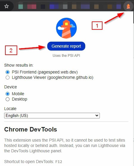
Click “Generate Report” to open a new tab.
The report will tell you which elements of your website need tweaking.
When you’re creating your site, pick a design that’s both user-friendly and responsive. You want your website to adapt to different screen sizes seamlessly.
Users expect flawless performance on smartphones, so it’s crucial to focus on:
- Adapting to various screen sizes
- Enhancing loading speeds
- Simplifying navigation
- Improving overall user experience
Let’s briefly talk about the advantages of having a responsive website.
| Advantage | Description |
|---|---|
| Improved User Experience | A responsive website adjusts seamlessly to different screen sizes, providing a better user experience and increasing the time visitors spend on your site. |
| Increased Mobile Traffic | A significant portion of web traffic comes from mobile devices. Responsive design ensures that these users have an optimal viewing experience. |
| Higher Search Engine Rankings | Search engines, like Google, favor mobile-friendly websites, which can help improve your website’s search engine ranking. |
| Cost-Efficiency | Maintaining one responsive website is more cost-effective than maintaining separate sites for desktop and mobile users. |
| Faster Loading Times | Responsive design often results in faster loading times across devices, leading to reduced bounce rates and improved user engagement. |
| Better Conversion Rates | A consistent and user-friendly experience across all devices can lead to higher conversion rates, turning visitors into customers. |
| Easier Maintenance | With a single responsive website, updates and maintenance are streamlined, saving time and reducing effort for the business owner. |
| Future-Proofing | Responsive design ensures compatibility with newer devices and future technology changes, protecting your investment over the long term. |
| Improved Analytics | Having a single responsive site simplifies the tracking and analysis of user interactions, providing clearer insights into user behavior. |
| Competitive Advantage | Businesses with responsive websites can outperform competitors who do not, by providing a superior user experience. |
How do you create a mobile-responsive design? Or, how to keep your site responsive?
Here are some powerful tips:
Prioritize Mobile-First Design
- Design for mobile devices first, then scale up for larger screens
- Simplify navigation for smaller screens (e.g., hamburger menus)
Keep Content Mobile-friendly
- Use legible fonts and appropriate sizes
- Ensure sufficient contrast for readability
- Make touch targets (buttons, links) large enough for mobile users
For WordPress Users
- Choose responsive themes or templates
- Leverage the built-in responsive features of your CMS
For Custom Website Owners
- Use responsive CSS frameworks (e.g., Bootstrap, Foundation)
- Implement responsive JavaScript libraries when needed
- Consider using CSS Grid and Flexbox for the layout
In addition:
- Implement Accelerated Mobile Pages (AMP)
- Consider progressive web app (PWA) technologies for enhanced mobile experiences
- Monitor analytics to understand user behavior across devices and optimize accordingly
- Optimize forms for mobile users, considering touch-friendly inputs and auto-fill options
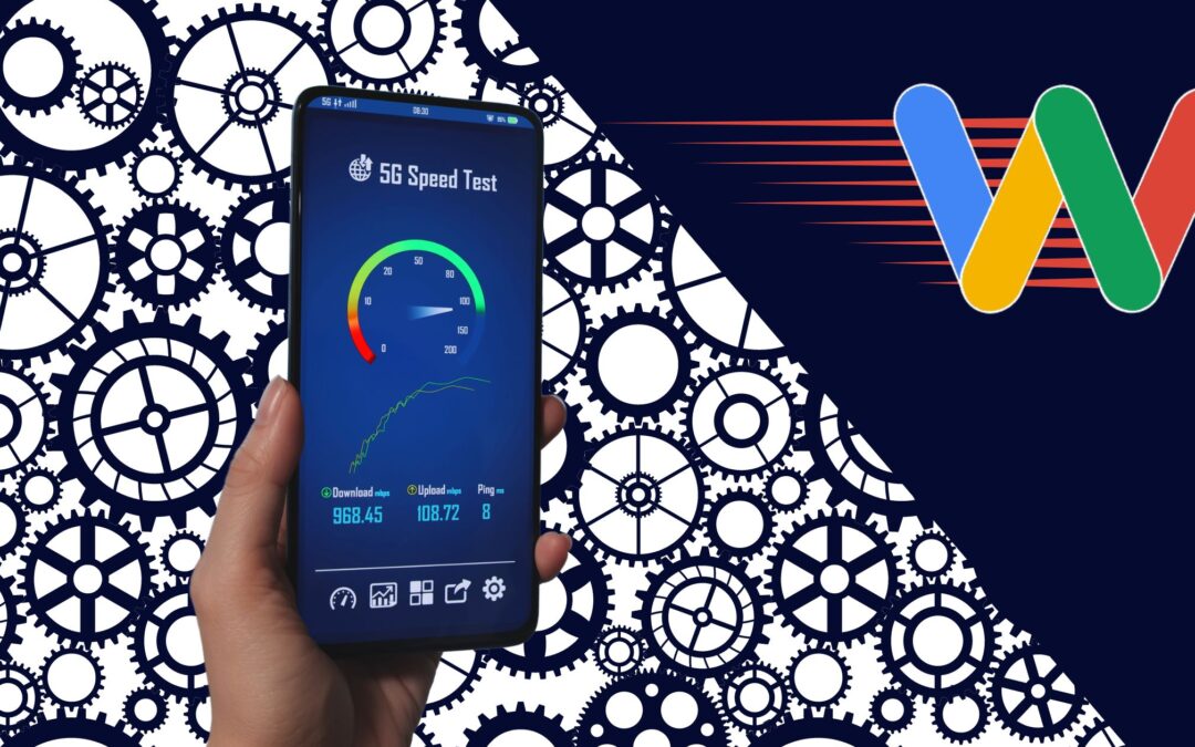
Optimize Your Website’s Loading Speed

The time your website takes to appear in front of an average visitor is a major search engine ranking factor.
This is because a long waiting time translates to a bad user experience.
So, a crucial part of mobile optimization is making sure your site loads as soon as possible on wireless networks.
According to Google’s own data, 53% of visitors abandon a website if it takes more than 3 seconds to load.
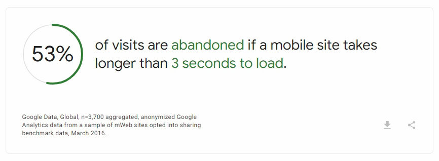
This means if your website isn’t loading within a few seconds, you’re losing a major chunk of your leads.
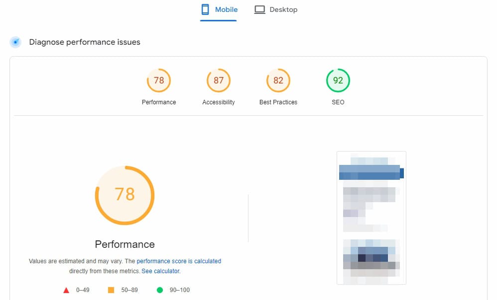
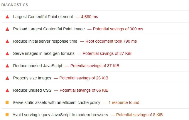
But, how do you accurately measure website speed?
More importantly, how do you know which elements or factors are making it slow? Google PageSpeed Insights!
Plug your website’s URL into the tool and let it generate a diagnosis.
You’ll get actionable suggestions as to which elements are slowing it down and what you should do about it.
Once you know where your website stands, it’ll be easier to optimize it.
There are a bunch of factors that make or break your site’s loading speed.
Let’s talk about each briefly.
The Size of Images (And other media)

Large image and media files slow web pages down.
Now, high-quality images are great for engagement. But, they don’t have to be too bulky.
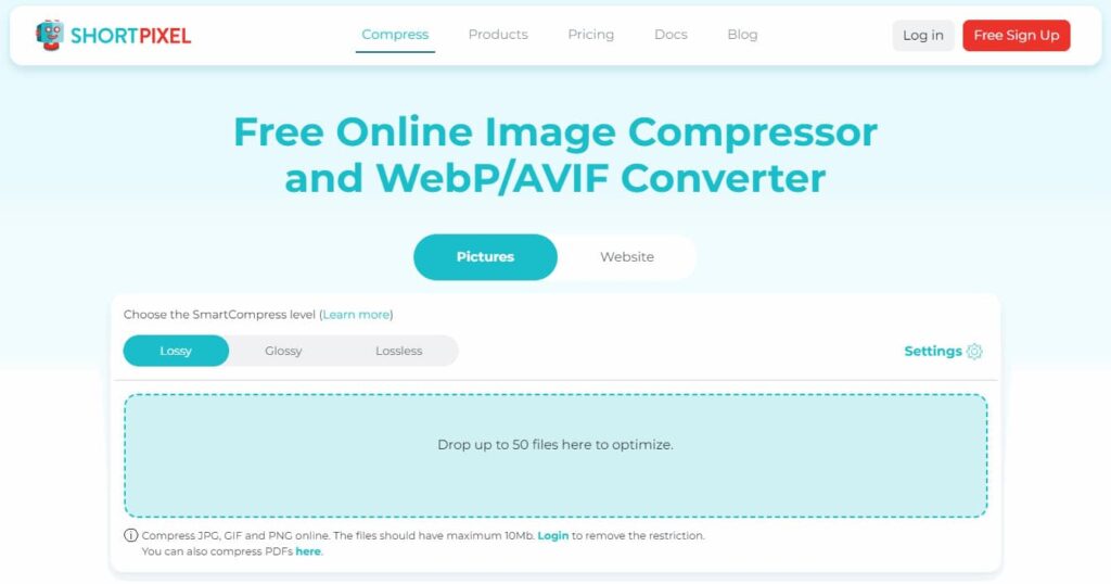
So, compress your images before uploading them to your server. You can use a simple and free tool like Shortpixel.
Alternatively, if you’re on WordPress, use a bulk image optimization plugin like EWWW Image Optimizer.
Web Fonts
Custom fonts may look good, but they can slow down your site.
Avoid using different font variations and weights. Consider using system fonts when possible.
Server Response Time
This is the time your server takes to respond to a browser request.
Longer times lead to slower websites.
Consider using a CDN to reduce the load on your server and invest in a good hosting provider.
Number of HTTPS Requests
Every element on a web page requires a separate HTTPS request.
Reduce this number by combining multiple files (Images, scripts, stylesheets).
Use of a CDN (Content Delivery Networking)
CDNs distribute your website’s content over several physical servers, reducing the physical distance between a visitor and the server.
This reduces the load on your origin server leading to faster overall loading times.
Browser Caching
This refers to a user’s browser saving your website’s content on their first visit.
As a result, when they return, your website loads quickly.
Minification of HTML, CSS, and JAVASCRIPT
Minification removes unnecessary code, such as white space, formatting, and comments.
HTML, CSS, and JAVASCRIPT minification reduces file sizes, which improves the loading speed.
Get Leads For Your Business With Our Custom Click to Brick Campaigns

The Use of Plugins
While plugins add functionality to your website, they come with a drawback: Extra code.
Only use a plugin if you need it. You want to conduct regular audits and remove unnecessary plugins.
Lazy Loading Status
Lazy loading keeps some elements of a web page, such as images and videos, from loading until they’re needed.
The result is a reduction in the time taken to load other more important elements.
You can also use lazy loading for comments, widgets, and other below-the-fold elements.
Test Your Website on Different Devices for Compatibility

Not all mobile phones come with the same screen size.
So, test your website on different mobile devices to make sure it’s truly optimized.
You’ll want to test your site on both iOS and Android devices to cover all your bases.
Plus, the goal is to make sure it offers a seamless experience on all popular screen sizes. Not just mobile phones.
Here are the 9 most common device types based on resolution and aspect ratio:
| Device Type | Resolution (Width x Height) | Aspect Ratio |
|---|---|---|
| Mobile – Small | 320 x 480 | 2:3 |
| Mobile – Large | 375 x 667 | 9:16 |
| Mobile – Extra Large | 414 x 736 | 9:16 |
| Tablet – Small | 600 x 960 | 5:8 |
| Tablet – Large | 768 x 1024 | 3:4 |
| Tablet – Extra Large | 800 x 1280 | 5:8 |
| Desktop – Small | 1024 x 768 | 4:3 |
| Desktop – Medium | 1366 x 768 | 16:9 |
| Desktop – Large | 1920 x 1080 | 16:9 |
Optimize for Local Search
Optimize your pages for local search if you’re a local business trying to reach an audience in particular areas.
Most people use their mobile phones to search for businesses near them.
Mobile searches often have local intent, for instance, “restaurants near me”.
Local SEO involves:
- Claiming and optimizing your GBP (Google Business Profile)
- Ensuring consistent NAP (Name, Address, Phone number)
- Using local keywords in your content
- Creating pages for multiple locations
- Implementing schema markup
- Building local backlinks
Simplify Navigation for Touchscreens
Android and iOS devices use touchscreens, making them different from mouse-operated desktops/laptops.
Since the screen is small and users use their thumbs to click on links, you want to use well-spaced buttons and links for easy tapping.
In addition, the navigation menu on your site looks different on desktops and mobile devices.
Use hamburger navigation to let mobile users easily navigate to the desired page on your site.
You may also want to use a sticky navigation menu to offer quick access to the most important pages.
Use Mobile-Friendly Pop-Ups

Pop-ups can be annoying if you don’t use them correctly.
You need to be careful when using pop-ups for any marketing reason.
For instance, showing a pop-up who just landed on your site isn’t a good idea.
A large majority of your visitors are mobile users. If the pop-up covers the entire screen, visitors won’t have access to the main content.
So, make sure your pop-ups are small and non-intrusive.
Also, remember that Google penalizes websites that use intrusive interstitials.
This means pop-ups are bad for:
- User experience
- Your website’s search engine rankings
Use exit-intent pop-ups. These are pop-ups that only show when someone has consumed the main content and is about to exit the page.
Also, consider using banners (For ads and information) and in-line forms (For newsletters). They’re less intrusive and can be equally effective.
Mobile Site Optimization: Frequently Asked Questions

Here are some frequently asked questions about mobile optimization.
Why is Mobile Optimization Important?
Most people visit websites on their phones. If your site isn’t mobile-friendly, you’re probably losing visitors. Plus, a better user experience means happier customers, which means more conversions.
How Does Mobile Optimization Affect SEO?
Google is all about mobile-first now. A mobile-optimized site offers optimal user experience, which Google loves. Search engine optimization helps you rank higher for mobile search queries.
What’s the Impact of Page Speed on Mobile SEO?
Page speed is everything on mobile. People aren’t patient – they’ll bounce back if your site is slow. Search engines like Google are smart enough to know this, so they factor in speed when ranking web pages. Simply put, quicker page speed leads to better SEO performance.
How Can I Test My Mobile Optimization?
Google’s own PageSpeed Insights has all the technical details you want to know about your site’s performance. Plug your URL into the tool and you’ll get a complete diagnostics with actionable instructions on improving the performance.
Blake’s Final Thoughts

Let’s face it: we’re living in a mobile-first world. Optimizing your website for mobile isn’t just a nice-to-have, it’s essential.
We’ve covered a lot of ground here, from responsive design to speed optimization and user-friendly interfaces. The key takeaway?
Put yourself in your mobile users’ shoes. Think about what they need and how they interact with your site.
How long would you wait for a site to load? Will you trust a web page that doesn’t offer a smooth experience?
Know what matters to mobile users and search engines. Implement SEO and user-experience best practices.
Don’t stop there
Test your website on different devices and don’t be afraid to make changes.
Remember, mobile optimization isn’t a one-and-done deal – it’s an ongoing process.
Keep an eye on your analytics, stay updated with the latest trends, and always be ready to adapt.
By following these tips, you’ll not only improve your site’s performance in search engines but also give your users a smooth, enjoyable experience.
You May Also Like: How to Track SEO Results (Everything You Should Know)
